Meatless
Overview
when:
April 2021 - August 2021
Objective:
Build a tool to make it easier for people who want to eat less meat to find meatless options at restaurants.
my motivations:
I had built a few small projects, but I wanted to build something more complex and test my ability to learn new technologies at the same time. I decided on the objective above because I had recently become vegetarian and found that it was pretty difficult to scan most menus and figure out what I could eat.
technologies:
Flutter, Dart, Node.js, MongoDB, Puppeteer (headless chrome).
Current solutions:
Apps like DoorDash and Yelp allow you to filter for “vegetarian” or “vegan” restaurants. However, these are usually just restaurants that have the word “vegetarian” somewhere on their menu, in their description, or in their name. I also found during some initial chats that people (even those who wanted eat less meat) had an aversion to the word “vegetarian” because they felt that it implied commitment or affilation with a lifestyle that they didn't want.
The final product:
A native app that allows you to search for restaurants and menu items by zip code, sort restaurants by number of vegetarian dishes or the ratio of vegetarian main dishes to all main dishes, search for specific dishes within results, star dishes you’re interested in, submit reviews and ratings for dishes, and report dishes that contain meat.
Scraping DoorDash (it's not not allowed)
How the scraper works:
- Launch Puppeteer (headless browser).
- Navigate to DoorDash's website.
- Click into every food category and scroll down to scrape links until you can’t scroll anymore.
- Remove duplicate links.
- Navigate to each link and click into each dish one by one to scrape its name, images, description, and ordering requirements. Write this information to a MongoDB database.
I scraped DoorDash for restaurant information because a lot of restaurants had moved onto the platform during the pandemic, and it’s also the most widely used food delivery app in the US. It was a bit difficult to get started because DoorDash has a dynamic website (this means that the html/css for the website are changed by code running in the browser and/or on the server), and the tutorial I had watched was for scraping static websites. After a bit more looking around, I found that I needed to use a headless browser (in this case, Puppeteer) to mimic human interaction with the website. Using a headless browser, I could imitate actions like clicking on things, typing, scrolling, waiting for elements to load, and running code in the browser console.
Another big issue I ran into was with selecting the elements I wanted to interact with. When I first tried to run my code that targeted DoorDash's gibberish class names, I found that DoorDash had an anti-scraping measure in place that scrambled class names when it sensed scraping. This made the whole process more tedious because for every element I wanted to interact with, I had to either find distinctive features that I could select for, or find a distinctive neighbor/parent/child and traverse the DOM. Unfortunately, because I had to do it this way, my current scraper fails as soon as any DoorDash engineer decides to add or remove an element from their element tree (which actually did happen while I was scraping).
After a few weeks, I ended up with a database of 1,100+ restaurants and 60,000+ dishes, all ready to be classified.
A not-so-brief venture into ML
TL;DR
I tried using ML classifiers and they weren't as good as my brute force algorithm :(( The brute force algorithm works like this:
- Check if a dish's name or description contains a meat word. If yes, it's not vegetarian. If yes, but it also has a word like "impossible" or "beyond", go to step two. If no, go to step two.
- Check if the dish's requirements can be fulfilled with vegetarian options. If yes, it's vegetarian. If no, it's not vegetarian.
I did some initial Googling and discovered that the kind of problem I wanted to solve was called a binary classification problem. I wanted an algorithm that took in the name, description, and requirements of a dish and returned whether or not it was vegetarian. Before I could even get started with models, however, I had to prepare my training and testing data. I created strings for 2,500 dishes (consisting of their name, description, and requirements) before labelling and spliting them into testing and training sets (20/80, based on the Pareto principle).
I then trained and tested logistic regression models, neural networks, and naive Bayes classifiers. Immediately, I was able to rule out the naive Bayes classifier because its results were only 10% better than guessing. I'm not sure why this happened, but I think it may be because the Bayes classifier assumes conditional independence of the features (in this case, words), of an instance (a dish string), which did not hold for this case.
The other two models slightly underperformed my brute force algorithm in terms of accuracy given a dish was vegetarian and overall accuracy. To make sure that the neural network and logistic regression models would consistently underperform my brute force model, I trained 100 more of each model on different 20/80 divisions of the dataset and calculated the average result. Because the average results were still worse than my brute force model, I decided to use my brute force model for production.
Prototyping with Figma and testing out my UI with friends
While building the prototype, I struggled with balancing the features I wanted with the features I knew were realistic. I ended up prototyping my ideal version and cutting features during production. Here are the features I prototyped:
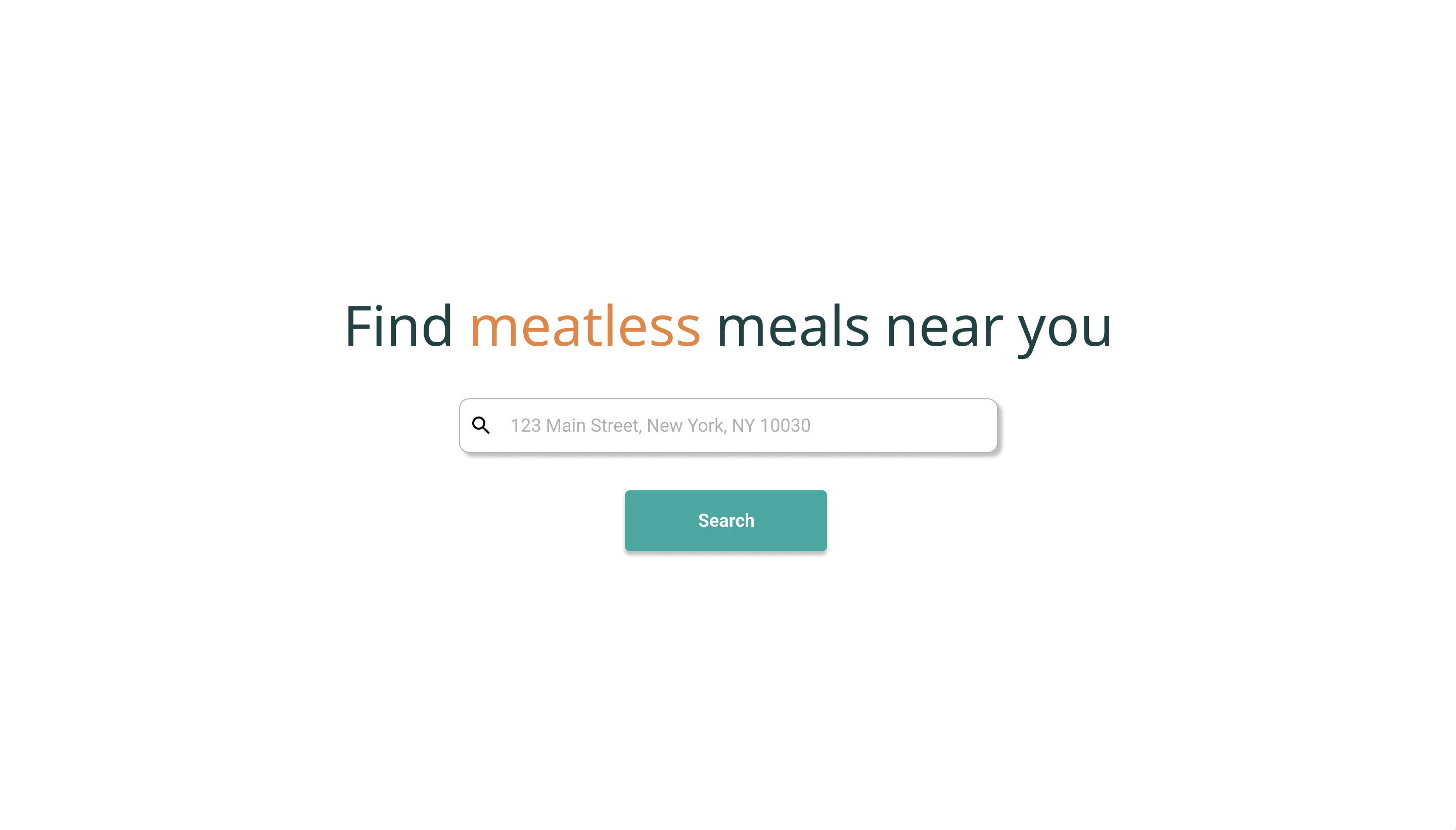
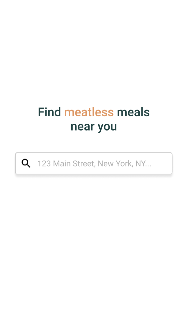
- A landing page for entering your address.
- A restaurants page for returning restaurants near you. On this page, each restaurant has a card that contains their vegetarian friendliness rating (the ratio of vegetarian main dishes to all main dishes) in the form of a pie chart, a brief description of their food, their rating (the average rating of all the main dishes), their distance from your current location, their hours, and the number of mains, sides, and desserts they offered. On this page, people would have the ability to sort results, search within results, and filter results by hours.
- A detail page for each restaurant that lists the vegetarian mains, sides, and desserts they have available.
- A dishes page for returning dishes near you. On this page, each dish has a card with its name, description, restaurant, distance from your current location, hours, rating, reviews, and price. Each card also has a pin icon used for pinning dishes you're interested in (this feature is replaced by stars in the production version). On this page, people would have the ability to sort results, search within results, and filter results by hours.
- A detail page for each dish that has the same information as the dish card, expanded reviews, a form to leave a review, and a form to report the dish for containing meat.


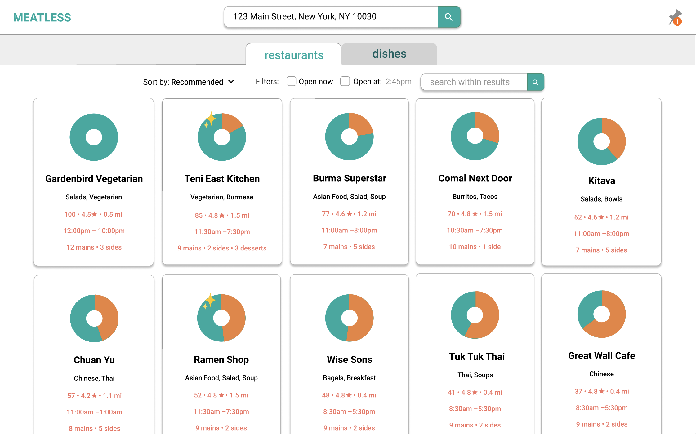
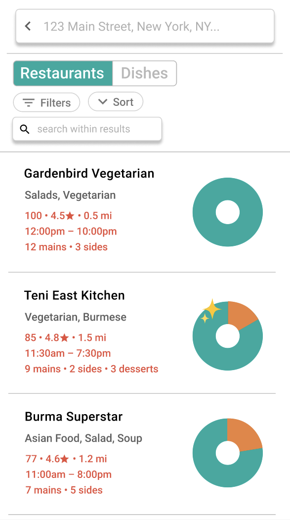
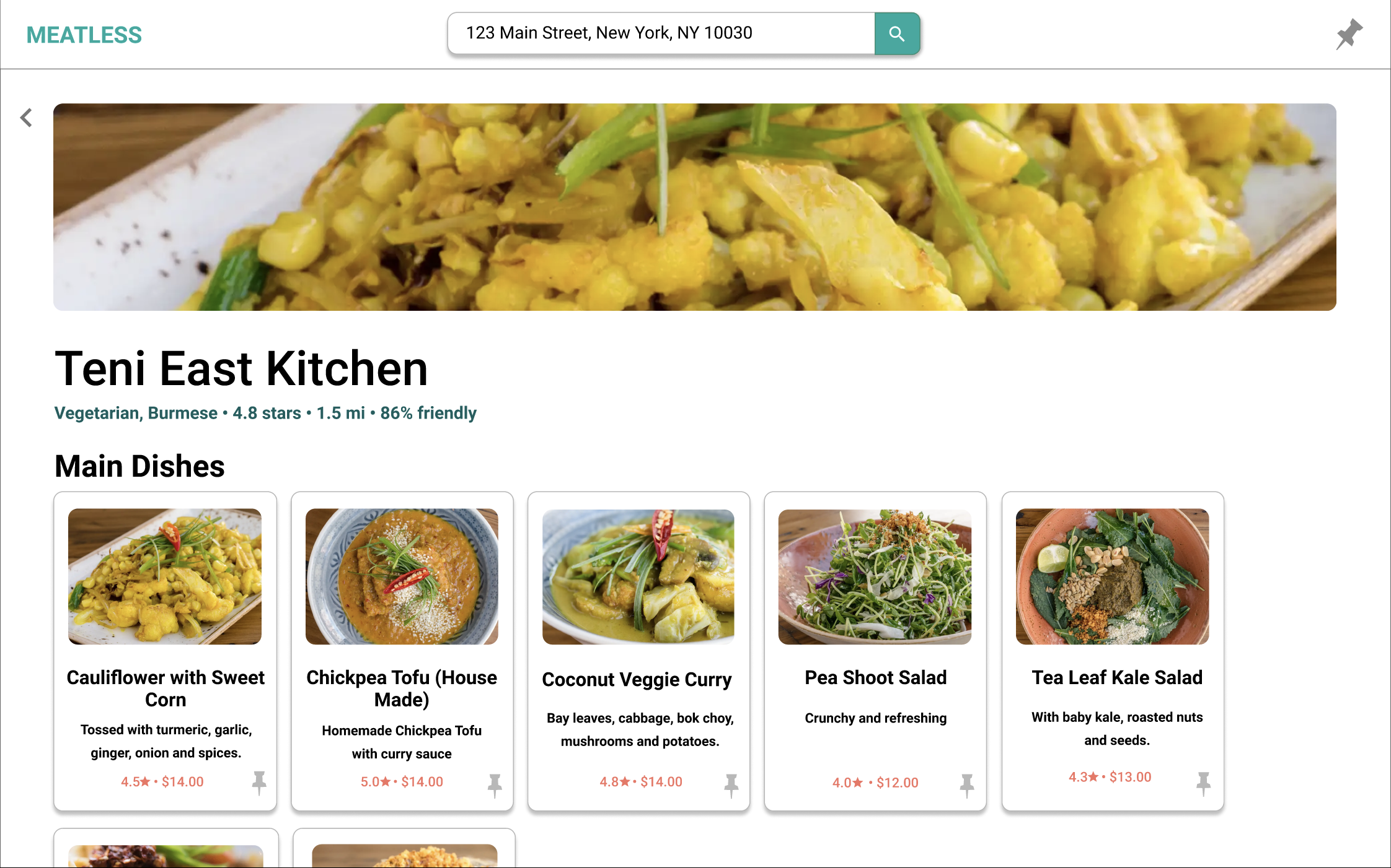
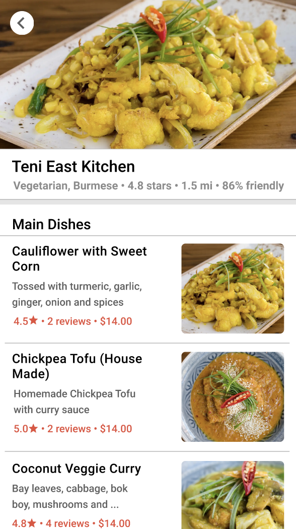
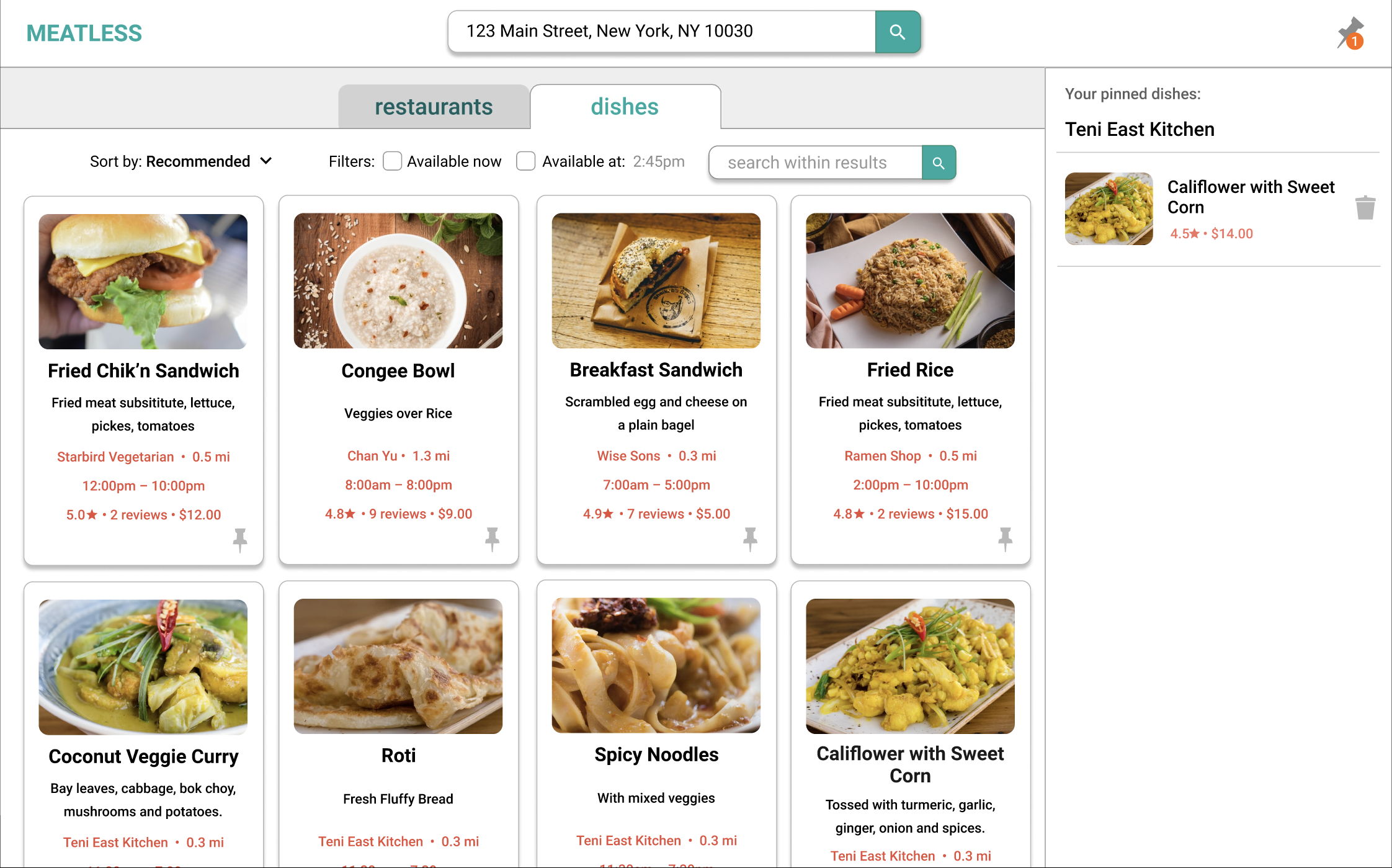
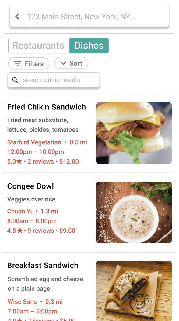
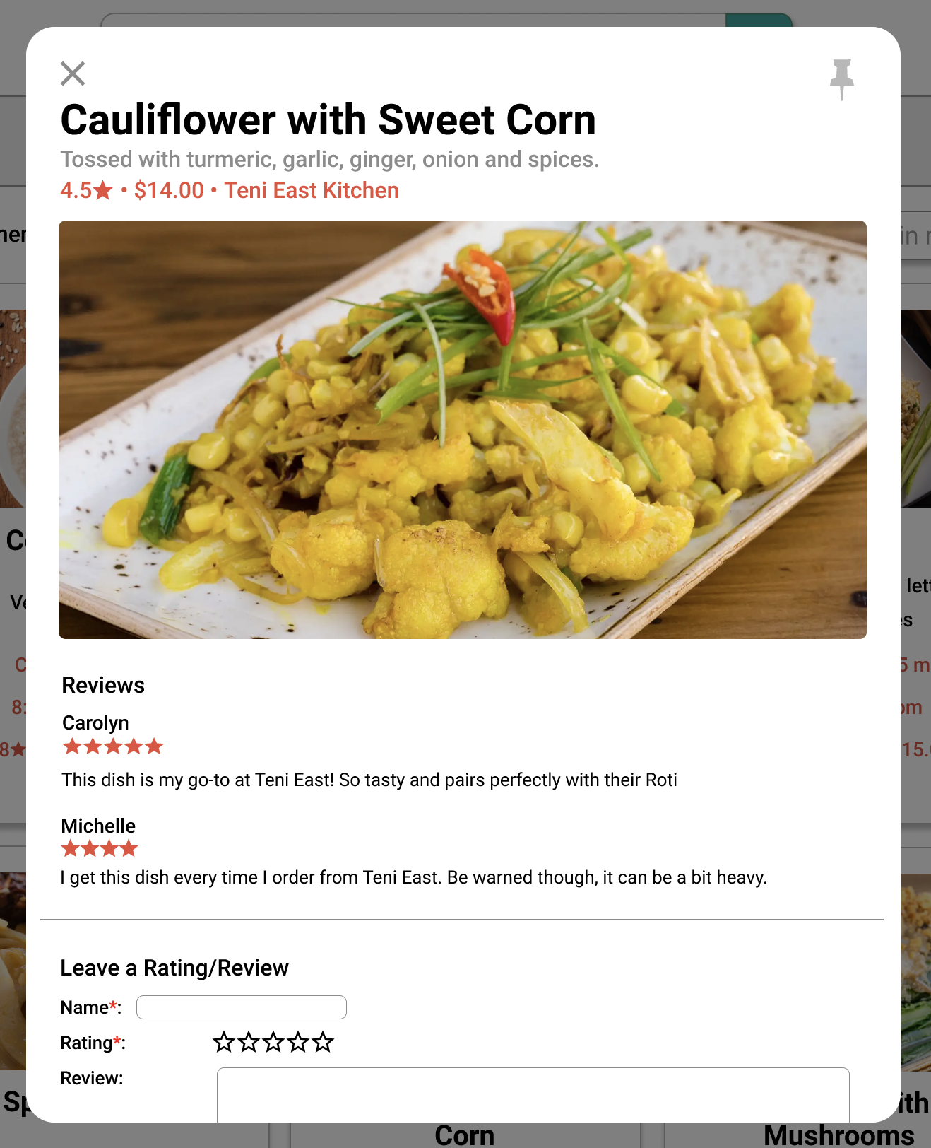
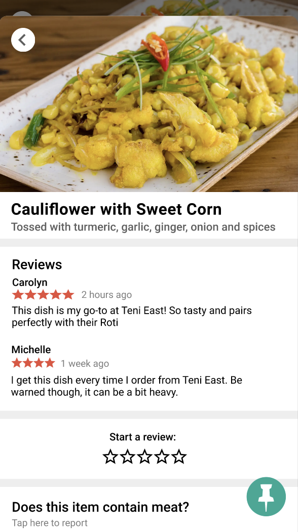
Once the prototype was ready, I asked three of my friends to test it out and say their thoughts out loud while I took notes. I tried to provide as little direction as possible so that could I get a good gauge of which features were confusing and which ones were intuitive. My notes from these sessions are available here.
Big takeaways from UI testing:
- The images on the dishes page made the entire site more attractive (and made everyone hungry).
- The meaning of the pie charts on the restaurant page is not immediately clear, but becomes clear after prolonged interaction with the site.
- Colors should be kept to a minimum to enhance the images of food
- There is a strong desire for more filters (e.g. cuisines, food allergies)
Learning Flutter and developing my app!!
I decided to learn Flutter because I wanted my app to run natively on iOS, Android, and the browser and it seemed convenient that with Flutter I could do this all from one codebase. I also wanted to see if my experience with React would translate to other frontend frameworks. To my delight, it did! Flutter also has stateful and stateless class components, the ability to set states and initiate re-renders, and built-in elements (called widgets). Each kind of widget has its own specific attributes. For example, an IconButton widget has a icon attribute to specify which icon you want to make into a button, and a style attribute to specify styling. Attributes are set when the widget is called.
It was cool that Flutter had so many pre-built abstractions over their simpler elements for developers to use (e.g. they have a horizontal line divider that's just a thin container element that you can set the height, width, and color of), but also had the optionality of using simple elements to create your own custom elements. It felt like I was constantly discovering new ways to use their widgets to make my UI better!
Here's what Meatless looks like now:
- The landing page
- The restaurants page
- The detail page for a restaurant
- The dishes page
- The detail page for a dish
- A video click-through of the features
- The pin icons looked too busy, so I changed them to stars.
- I didn't implement any hours filters because it was too difficult to find the hours for each restaurant.
- I realized that infinite scroll didn't make much sense for my use case, so I made the restaurants and dishes displays paginated.
- Returning restaurants near an address was pretty difficult since I didn't have latitude or longitude information, so I made it so that you could enter a zipcode and find restaurants in that zipcode instead.
- Since all of my friends had been really attracted to the photos during the UI testing phase, I added photos to the restaurant cards on the restaurants page.
- I got rid of features that require users to be useful (reviews, ratings).
- local storage or accounts so that people can keep track of their reviews and reports
- ability to upload photos with reviews
- some solve for the fact that the web version is laggy because the images I scraped from DoorDash are too large
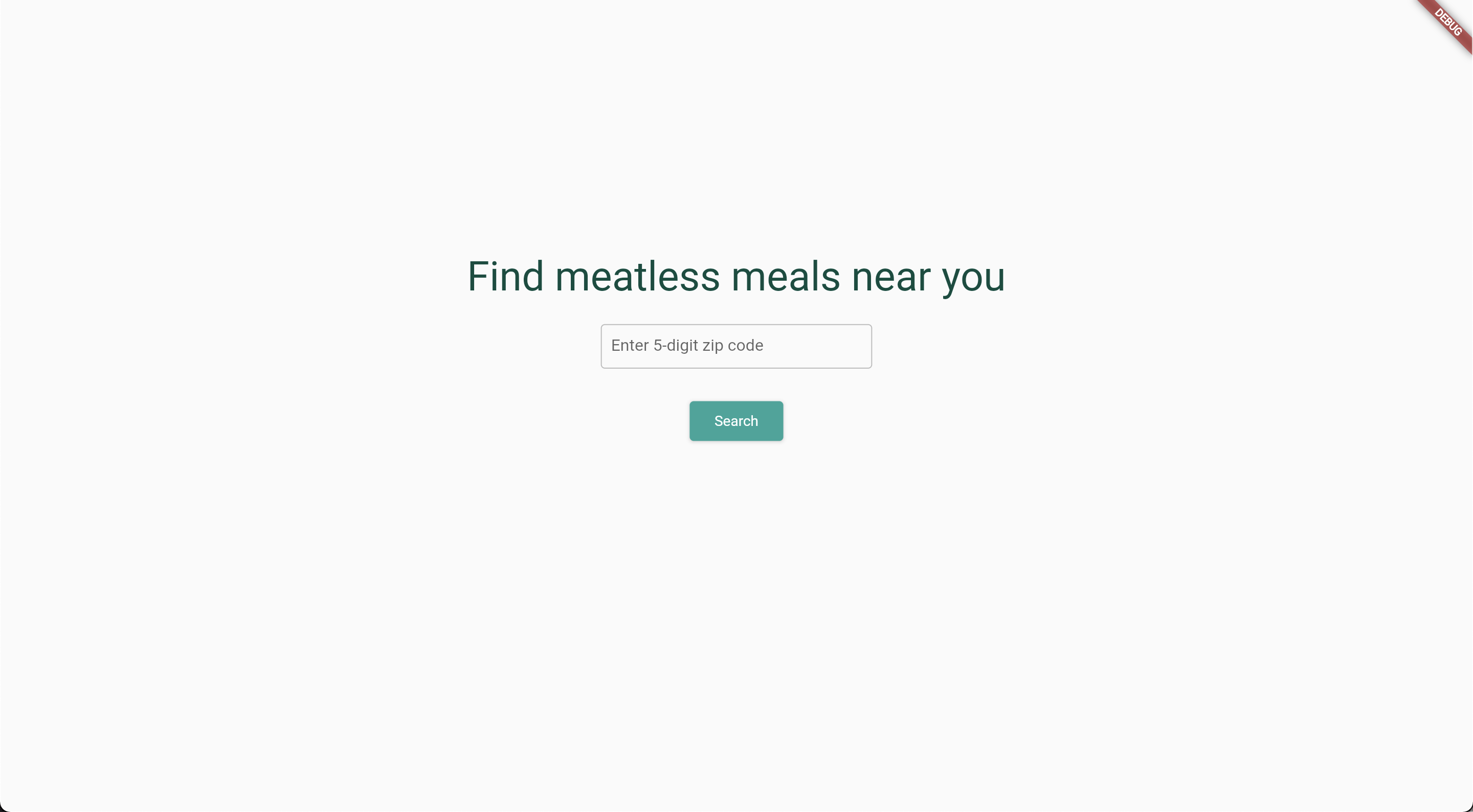
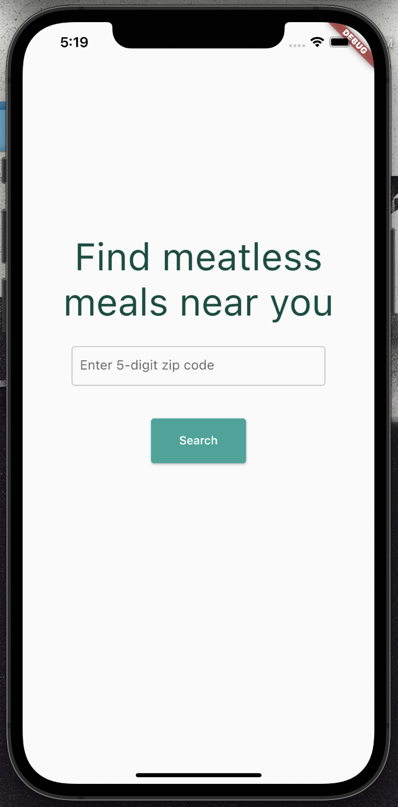
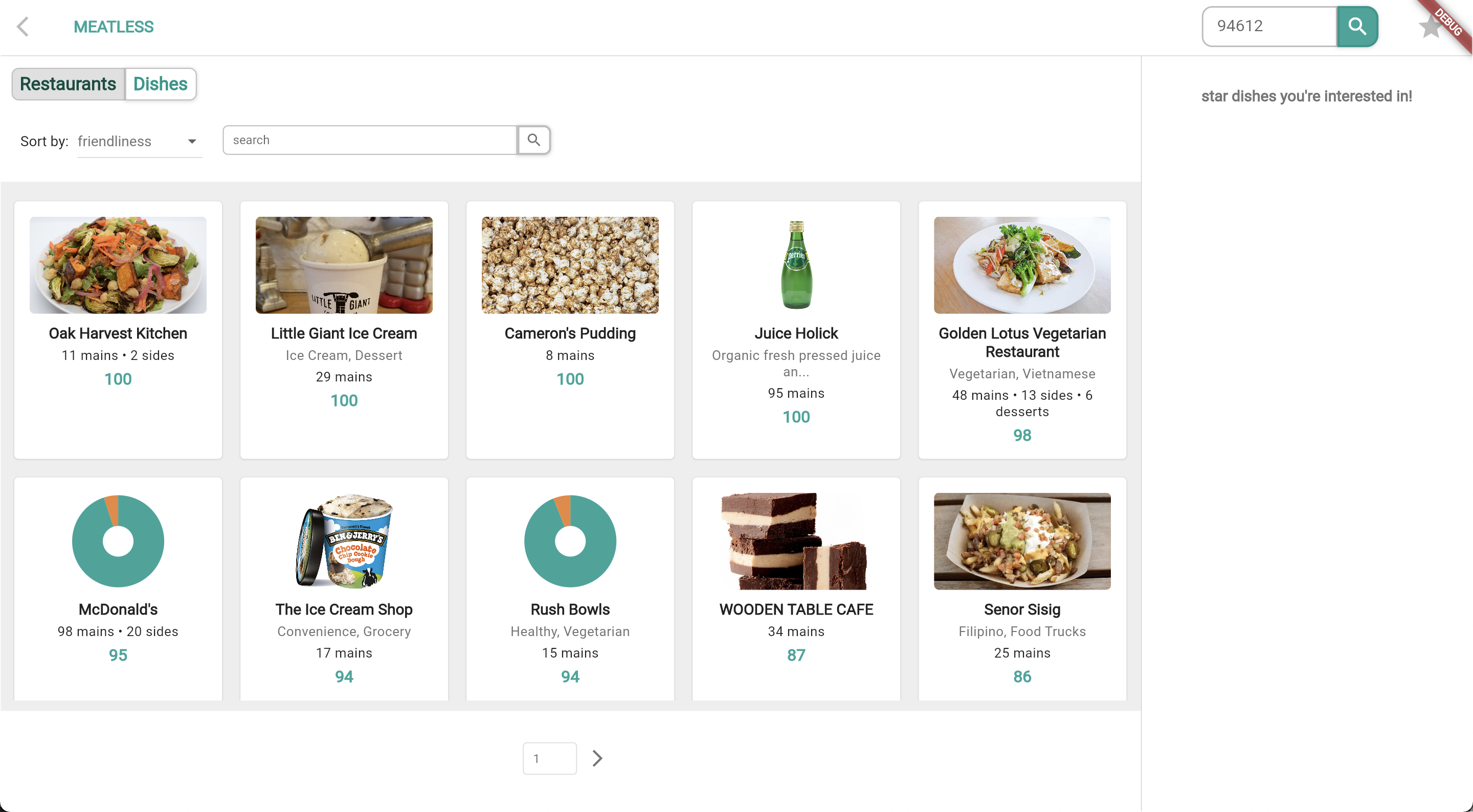
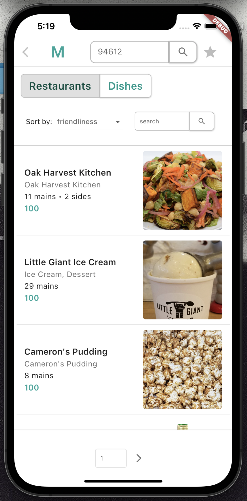
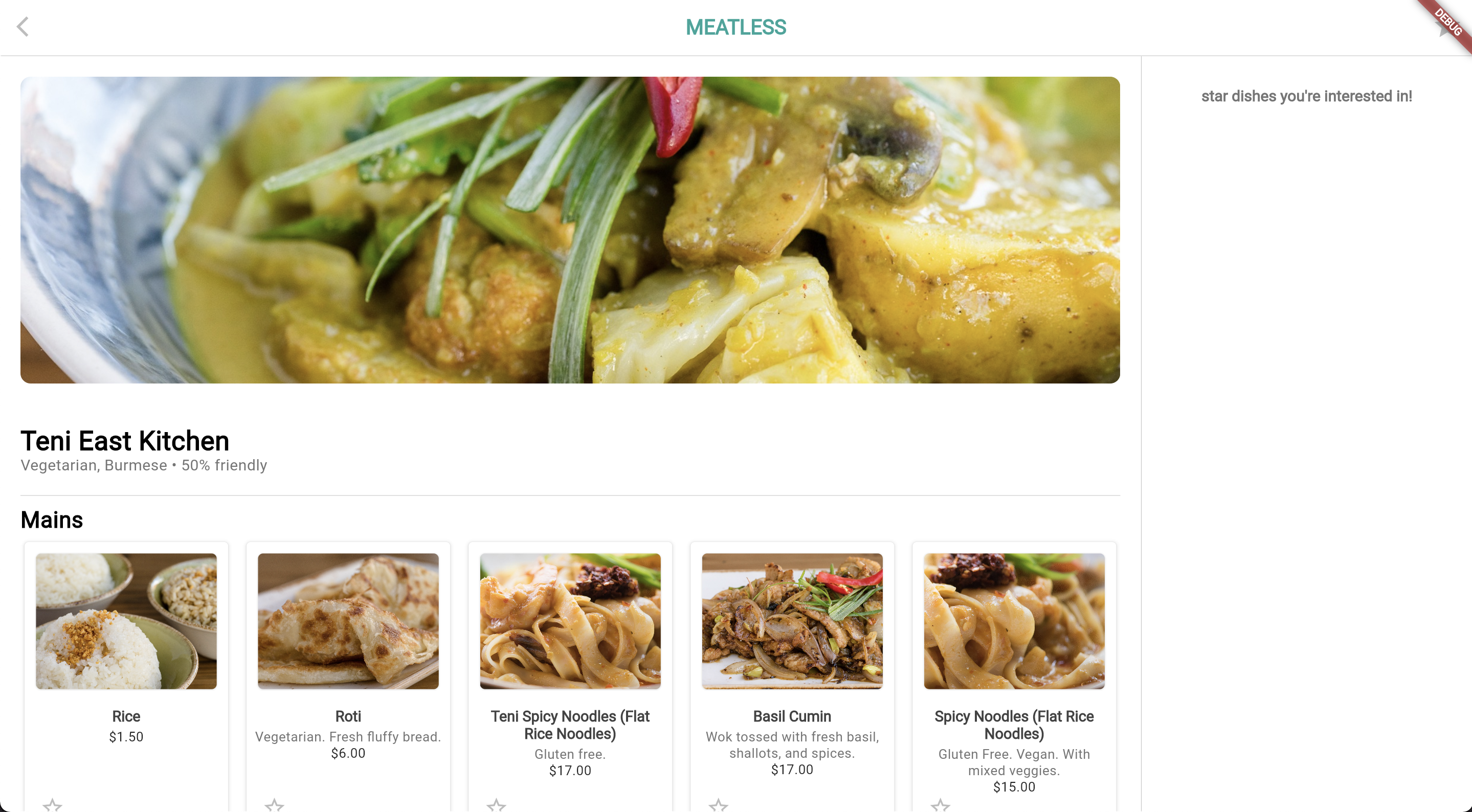
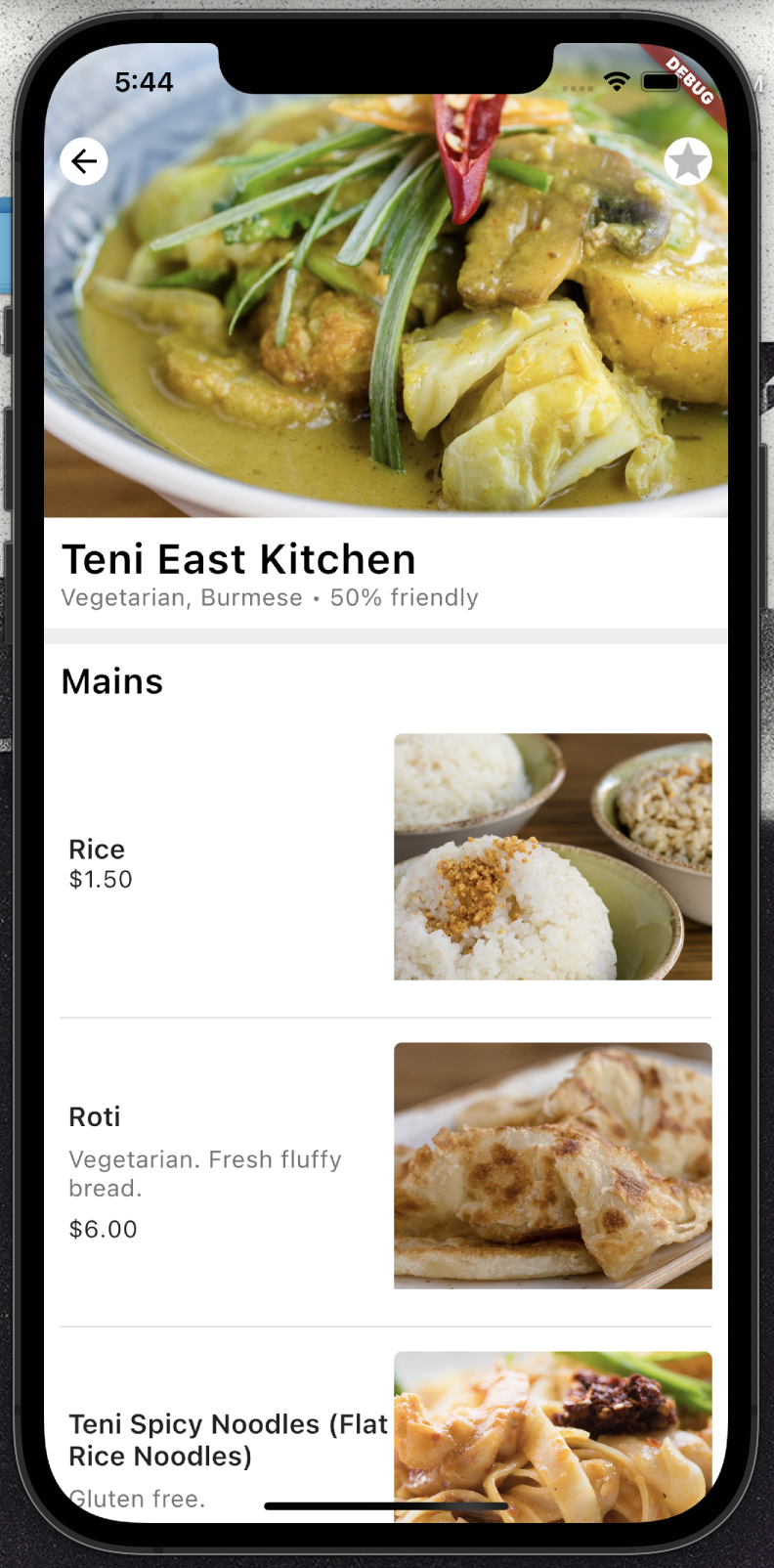
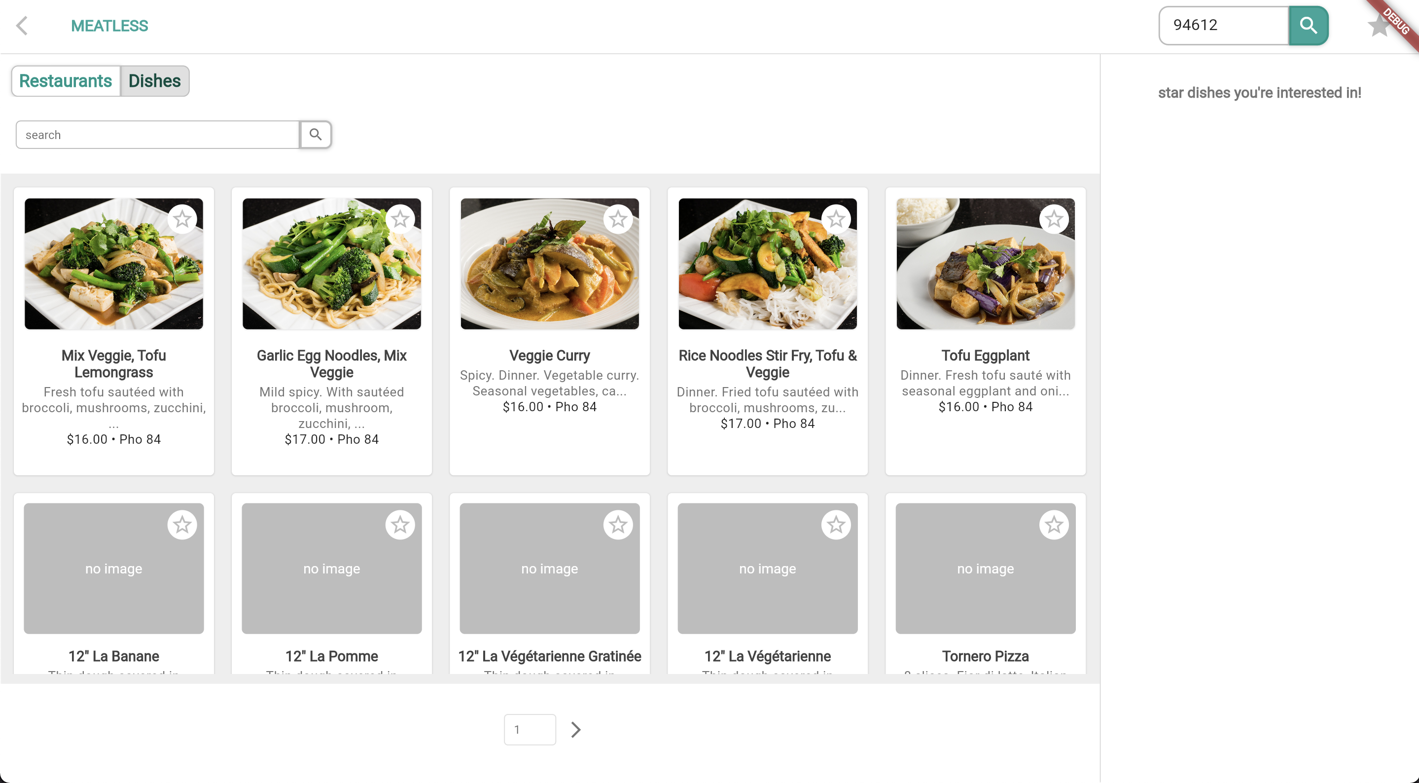
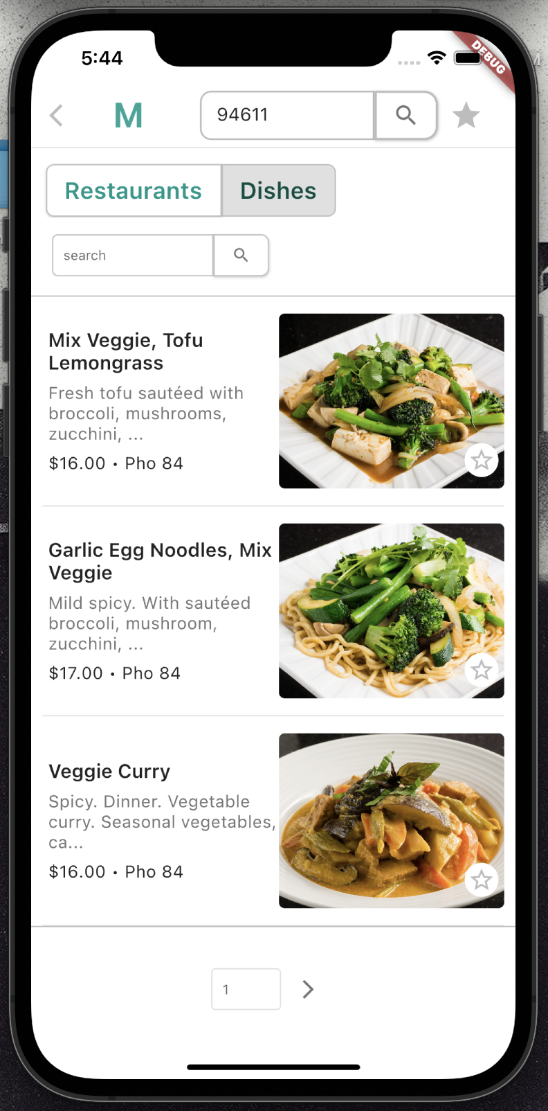
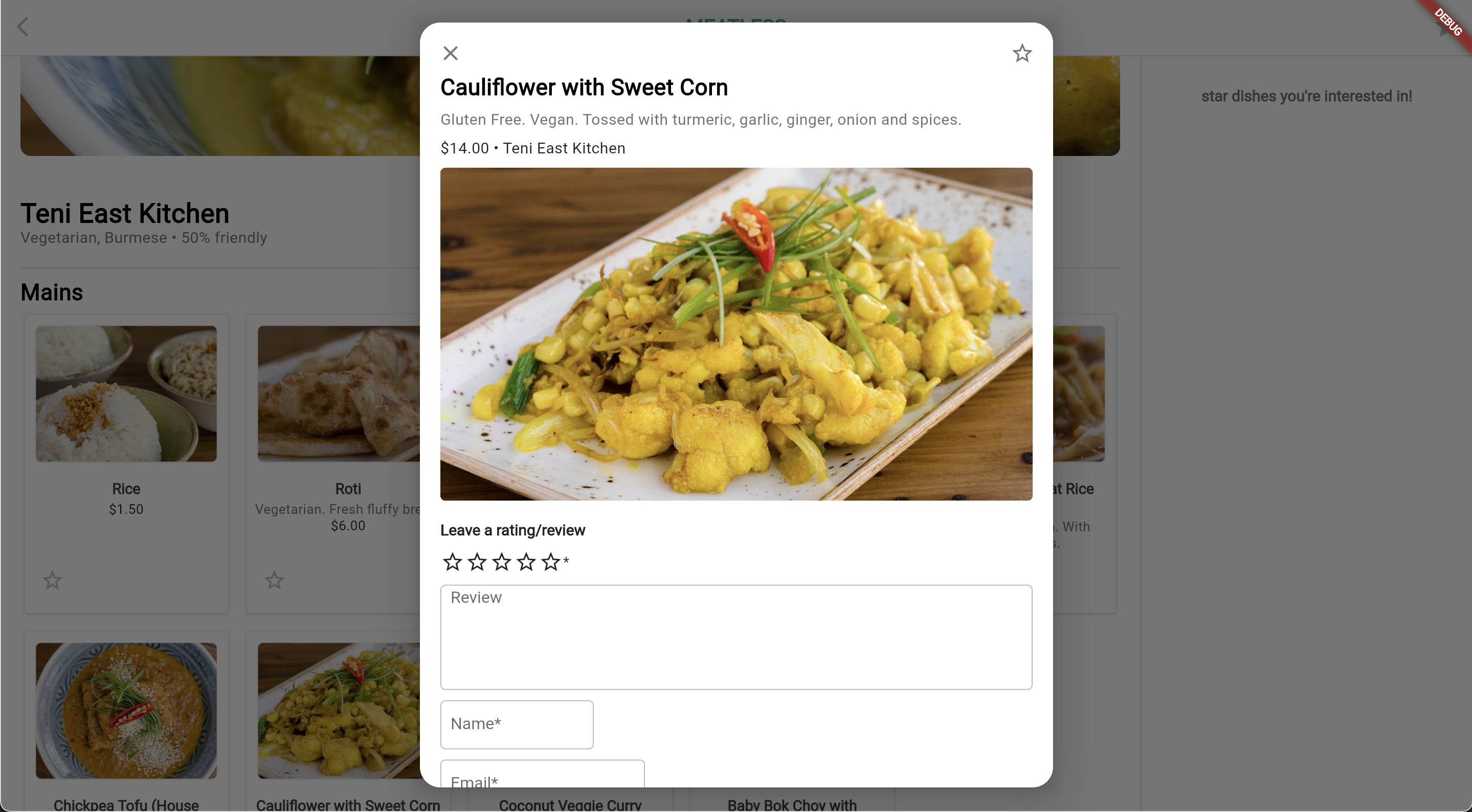
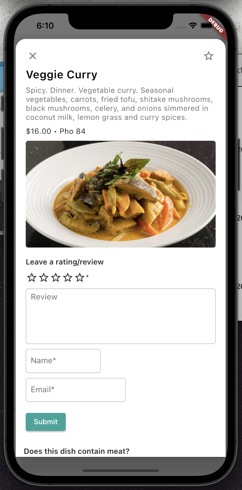
I'm really proud that the current version of Meatless is both responsive and adaptive! This means that it has layouts that change size depending on the screen size of a device and also deals with the different inputs and expectations that come with different types of devices. For example, the number of restaurant cards in a row changes with the screen width (responsiveness), and once the screen is less than 500 pixels wide, it changes to a mobile interface with lower visual density and a one column list instead of a grid (adaptiveness). Doing this required a lot of extra design and coding work, but I'm glad I did it! I was able to learn a lot more about Flutter and make an app that looks good on multiple device types as a result.
Major changes from prototype to app:
Mistakes I made (and learned from)
For a good part of this process, I was setting goals that were only doable if nothing I had built in previous weeks broke, or if nothing new came up during the week. This meant that when I had to do something urgently that wasn't a part of my goals for the week, I would get really stressed.
What I learned:
It's helpful for me to make two sets of weekly goals--what I want to get done in seven days and what I think I can get done in four days--and be okay with only completing the latter.
I made about 90% of my Figma prototype rectangle by rectangle, text box by text box, no reusable components, no layouts. In retrospect, I probably should've realized something was wrong when I spent a day just adjusting the margins pixel by pixel on all 50 of my dish cards, but hey, hindsight is 20/20.
What I learned:
If it feels like a tool to make something easier exists, it probably does and it can't hurt to do some quick Googling/documentation reading to look for it.
I actually had to scrape the exact same content from DoorDash twice because the first time I only scraped the names, descriptions, and requirements of dishes. I did this because I only wanted to scrape enough examples to create my training and testing data for the ML phase, but this really backfired on me because I 1) didn't have the information I needed for the app and 2) couldn't even use the information I had to find the information I needed (restaurant information, dish images, etc).
What I learned:
You can never have too much data! Even if it's not structured efficiently in your database, you can always run a migration later. You can't restructure information you don't have.
I made all of my Flutter components rely on each other for passing around information, specifically the starred status of dishes. While this might be fine for mobile apps, I realized this was an issue when I tried to route my web app and found that components kept erroring because when I routed to a new URL, they weren't able to inherit states from other components.
What I learned:
For web apps, it's probably a good idea to pass information that needs to go to components at different URLs through the backend. This way, when a page reloads, my components don't lose their state because it's not all on the browser.
What's next?
Next, I'd like to implement:
Even though there are still some bugs, I'm really happy with what I was able to do in a few months. I'm really thankful for everything I've learned about coding and about myself during this process, and it feels like I've become a better engineer along the way :))